The person artists call before the gallery does
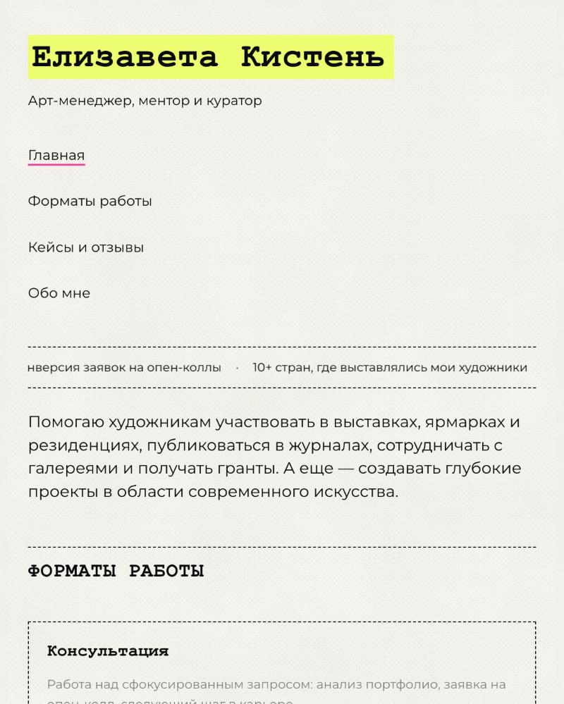
Elizaveta Kisten is an art manager, mentor, and curator: she gets artists into open calls, fairs, residencies, and journals, builds their portfolios, and develops curatorial projects — with credits spanning GES-2, the Tretyakov Gallery, MMOMA, and a Sotheby's auction for the Garage endowment launch. Her practice ran on reputation, Telegram, and word of mouth. The brief was to give it a home: one page that explains what she does, proves it works, and makes applying effortless.
Mentorship is invisible until you shape it
Services like "mentorship" and "portfolio work" are abstract — every mentor promises growth, and an artist deciding where to spend 30,000 ₽ a month has nothing to compare. Before the site, Elizaveta's offer lived in DMs: scope negotiated per person, results shared anecdotally, prices quoted privately. That ceiling is real — you can't scale a practice that must be re-explained in every conversation, and you can't build trust with people who haven't met you yet.
The design problem, precisely: make an intangible service concrete — what it includes, what it costs, what it has done for others — without flattening a curator's voice into marketing-speak.
Productized services, visible proof, one honest funnel
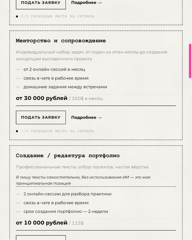
The site packages the practice into four clear formats — Consultation, Mentorship, Portfolio creation, Training — each specified like a product: what's included (sessions per month, chat access, homework), a fixed starting price in two currencies, and a live availability counter ("1/4 spots left for October") that turns a solo practitioner's limited time into honest scarcity.
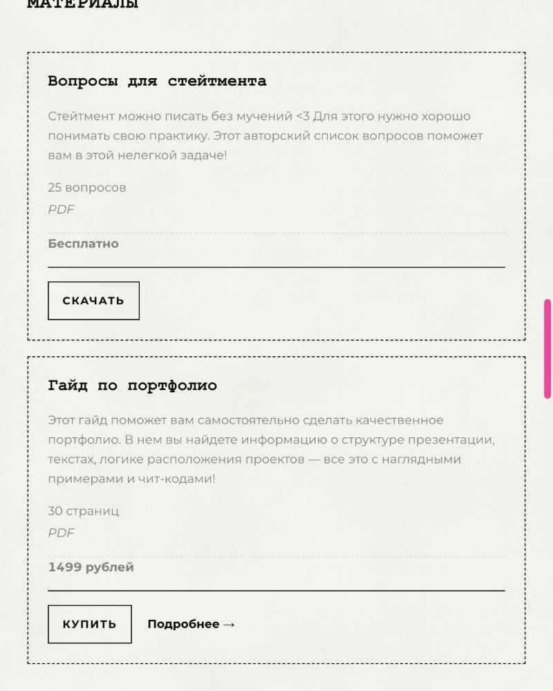
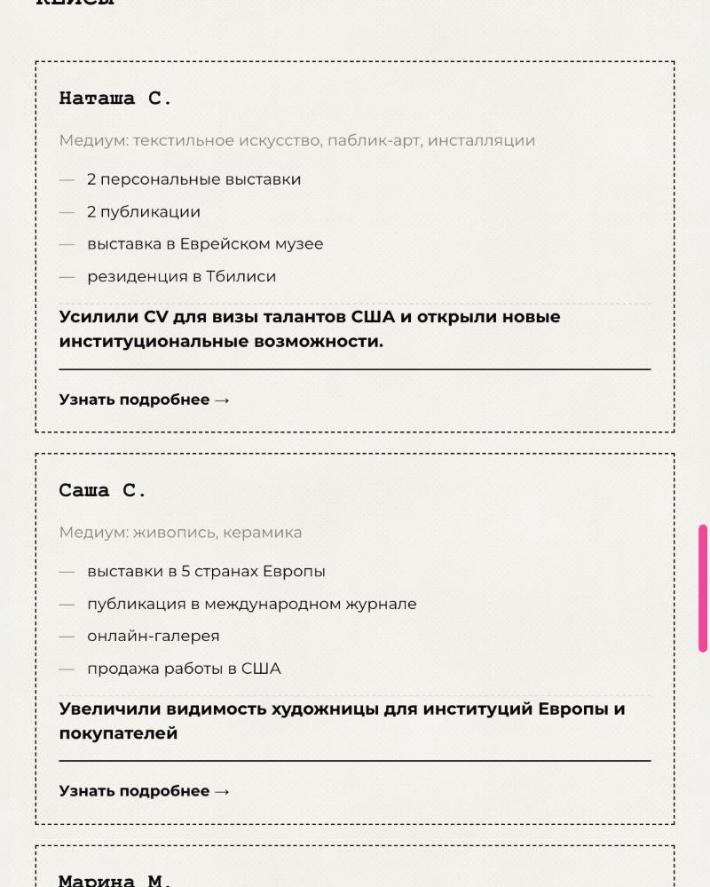
Proof is structural, not decorative. A ticker of hard numbers runs under the header — 40% open-call conversion, artists exhibited in 10+ countries, 42 program graduates. A Cases section tells three artists' stories as fact lists: solo shows, a Jewish Museum exhibition, a Tbilisi residency, a US talent-visa CV. Downloadable materials (a free statement worksheet, a paid portfolio guide) let hesitant visitors get value before committing. Every format ends in the same place: a one-tap application via Telegram, where the real relationship already lives.
Typewriter, highlighter, and a sheet of good paper
The identity borrows its materials from the art world itself. Headings are set in a monospaced typewriter face — the typography of curatorial statements, wall labels, and open-call paperwork. The background is warm paper, not screen-white. Sections are divided by dashed rules that read as cut-here lines on a worksheet. Over this quiet base, exactly two artifacts of a working mentor's desk: an acid-yellow highlighter that marks the name and what matters, and a hot-pink underline for the active link.
The restraint is the point. Her site states "I write my texts myself, without AI — on principle," and the design makes the same promise visually: no gradients, no stock photography, no template gloss — a page that looks hand-assembled by someone with taste, because it was.
#FAF9F4
#0A0A0A
#E8FF52
#FF3399
A practice that can grow without losing its voice
The site is built as infrastructure, not a brochure. The format cards absorb price and capacity changes month to month; the materials section is the seed of a product line that earns while she sleeps; the cases template turns every future success into marketing with zero design work. As the practice grows — more guides, a cohort program, English-language services — the page grows by addition, never redesign.
And the identity scales with it: typewriter type, paper, one highlighter. It works on a website, a PDF guide, a lecture slide at ARCH Moscow, or an Instagram story — a system simple enough for its owner to use herself, which for a one-person practice is the only kind of brand that survives.
From word of mouth to a front door
Elizaveta's practice now has what her artists get from her: a portfolio. Visitors arrive from a talk or a Telegram post and find the whole offer in one scroll — what she does, what it costs, who it worked for, and where to apply. The design holds her voice instead of replacing it, which is exactly what a trust business needs from its website.